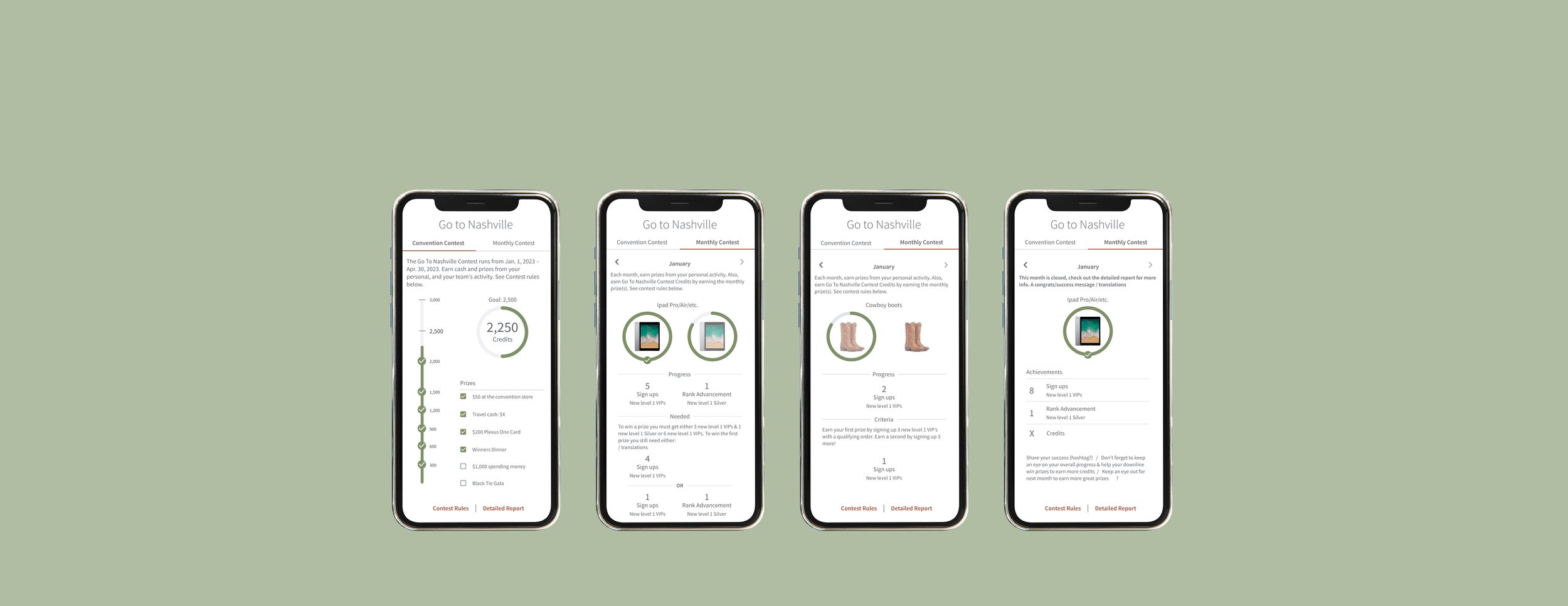
Contest Tracker
Lead UX Researcher and UX/UI Designer
Role
2022 into 2023
Problem
Enrollments, order sizes, overall sales, and engagement have been trending downward.
Solution
Reignite user engagement and build anticipation with a contest leading up to an annual event.
Create an interactive and visually engaging contest tracker that allows users to easily see progress within the contest as well as review any previous months activity.
Outcome
100% success rate of users tested were able to track progress quickly and accurately.
Users were thrilled with the end product saying it “exceeded expectations.” Stakeholders were excited by the designs saying “matched what I had in my head, but better.”
The end designs are flexible in they can be utilized for future contests.
Key Takeaway
I see issues with the end product but enjoyed the process and learned a lot along the way.
I will never look at how a list of prizes are presented the same way ever again.
Overview & Background
Convention is the largest annual event
Typically involves exciting announcements
Aims to motivate customers
Design Process
Discover & Define
Explored the Starbucks app and Starbucks for Life game, Fitbit, Apple Watch and My Fitness Pal
Clear indication of progress
High level overview and ability to dig in
Different formats to best present information
Ideate, Test, & Iterate
Initial wireframes:
Initially, I attempted to layout everything out but quickly realized it was becoming too cramped. A constraint to keep in mind is that tracker on desktop had to fit within a small dashboard tile.
Second iteration, I separated the convention and the monthly contests into two tabs to allow for more space. This iteration worked for lower value prizes but the higher value prize requirements was too cramped.
Third iteration was moving in the right direction and so I moved into higher fidelity designs in order to test with users. There was some more iteration prior to testing, shown below.
Initial Guerilla Usability Testing
The tab interface to segment information was successful and easily understandable.
Participants were a bit unclear on the horizontal flow and alignment of the prizes with the criteria
Confusion around which criteria “pathway” to follow to earn prizes, assumption that the bottom section was the only way to earn the second prize.
Upon some explanation there was some confusion on the top section as to why it didn’t have 3 indicators for sign up but that if it did then it would appear as though they had double.
Results:
I conducted another round of testing after incorporated the above feedback. The results were successful, with 100% of participants quickly and accurately understanding their progress and the remaining actions required to earn prizes. None of the previous misunderstandings and confusion were observed with the updated designs, which was an exciting outcome.
Second Iteration:
Stakeholder Sign off
In a review meeting led by the PO, stakeholders expressed excitement and satisfaction with the designs. Their positive feedback, including remarks like "exceeded expectations" and "matches what I envisioned, but better," highlighted the success. We agreed on minor refinements such as displaying prizes and adding a line to the previous month’s view to display earned credits. Below are the desktop and mobile versions, representing our final design prior to developer handoff.
Overarching Q1 Contest Tab:
Low Value Prize:
High Value Prize:
Previous Month Review:
Conclusion
Overall I am happy with the way the project went, with the collaboration with other teams, stakeholders and getting this out on time.
A few things I am very happy with:
Tab navigation optimize the amount of available space
The design could be reused with future contests following the same structure
Users can review previous months throughout the contest rather than only after the contest ends
If able to go back in time I handle the below differently:
On the mobile convention tab the point gauge went upwards while the list of prizes went downward which I overlooked which still haunts me especially in putting this case study together
Originally, I planned for icons by the gauge for each prize on the Convention tab, but to time constraints led us to present all prizes with a checkmark once earned.
Something I wish I would have seen earlier before release is that these look like normal interactive checkboxes.
In Production:
Effective communication and interpersonal skills are essential in cross-functional team collaboration.
Asking clarifying questions early on help prevent miscommunication and save time.
Flexibility and adapting to evolving timelines, requirements, and stakeholder inputs is crucial.
The designs were flexible and able to easily accommodate tweaks made to the contest rules post launch.
I see issues with the end product in production but enjoyed the process learned a lot along the way. I will never not look at how a list of prizes are presented the same way ever again.
I am still mad at myself for not catching the checkmark list of prizes but am pleased with the tab navigation to present the information without having to squeeze it in or leave important information out.


